Saturday, June 16, 2012

Madagascar 3 - Setting the Mood

   Mood. It is an aspect of every shot in every film, as inseparable from each moment as wet is to water. While character actions and expressions most certainly convey the emotions of various moments and individuals, different types of lighting also help to establish a particular atmosphere -- in fact, it's the key element in setting the mood.

   For this entry, I'd like to use Madagascar 3 as an example. Seeing as the film was only just recently released in cinemas, the availability of choice screen shots to choose from is limited. However, I still managed to find a fair few that effectively demonstrate what I wish to highlight.

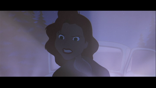
   Many sources and types of light are utilized in this film, including lantern light, neon lights, subway ceiling lights, and, of course, bright and subdued sunlight. One of my favorites is the foremost of those listed here -- lantern light. At this point in the film, our four main characters -- Alex, Marty, Melman, and Gloria -- have stumbled upon a traveling circus. Hoping to blend in and hide from an animal control officer who is pursuing them, they manage to convince the performers of the animal circus to tour with them for a time.

   This particular shot is interesting, because there are not one, not two, but three moods present here. Vitaly, the tiger, is critical and uncertain of the newcomers. Notice that the film-makers set him in the darkest area on this side of the train carriage, obscured by shadows and set apart somewhat from the light. Naturally, this choice results in him appearing more intimidating than the other two characters. Gia, the leopard, is more curious. (She was also the first to let the newcomers on the train.) While she remains in the background, the light illuminates her features and gives her a friendlier air. Stefano, the sea lion, is very hopeful, and, taking into account this fact, it's interesting that it is he who is holding the lantern. Notice the symbolism. You see symbols like this throughout both animated and live action films, including costumes, colors, objects, and, of course, lighting choices.


   We now encounter another mood: fear. In terms of lighting, if had to pick a top favorite sequence in the entire movie... this part would be it. Although a number of generic horror/suspense symbols are seen in this moment (chains/sharp objects hanging from the ceiling; scratches on the walls; bones on the floor; etc., most of which are not pictured here), including the lighting, the way they handled the light itself was, in my opinion, absolutely beautiful.

   In this moment, Julien, Maurice, and Mort have stumbled inside one of the circus train's carriages, and they're not alone.... Since the characters are stationed in an old train and not a jail cell or psychiatric ward, and in a carriage with no electric sources at that, natural light had to be utilized to further emphasize the tension felt and give us the impression that we're in a seemingly unpleasant place. Although we're not exactly sure where the train is moving through at this point, we can surmise that it's either going in and out of tunnels or simply brushing through a very dense forest area where light has difficulty reaching its arms through; however, when it does penetrate the darkness, it's stark, abrupt, and invasive, cutting the walls and floor and slashing the characters' bodies. When the creature amongst them is revealed, however, we cross over to a completely different atmosphere....


   What a contrast! As soon Sonya the bear is revealed, Julien falls head over heels for her, and the lighting changes from very harsh and condescending... to incredibly warm and inviting. At this point, the train has emerged into direct sunlight, and this change completely engulfs the carriage, bathing it and its characters in a soft, beautiful atmosphere.


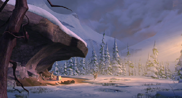
   Last of all, we have the Alps. While not the most flattering image, I absolutely love the way the sequences with the characters in the Alpine mountains was lit. It gives the place a relaxing and welcoming air and makes it seem even more open and spacious than it already is.

   ------------------------------

   When the film comes out on DVD, I will have to find better shots and go over those. In the meantime, to get the full enjoyment out of this beautiful film... go see the movie!!

   -- "Mitch"

   All images are © DreamWorks SKG.

Wednesday, April 25, 2012

The Iron Giant - Backlighting/Harsh Lighting

   There are many ways to emphasize moments of tension, anxiety, and suspension in a film, be it via specific camera angles, pacing, colors, and, of course, believable/convincing acting. Yet another layer that may be added onto these aspects is the element of light; in this case, harsh lighting (including backlighting/rim light). Illuminating a portion of a character or scene with very direct light can bestow upon the situation (and its audience) an unsettling feeling, making for a stronger moment.

   One film that I find to represent several good examples of this is Brad Bird's feature-length production, The Iron Giant....


    This is one of my favorite shots in the film. I love the effect of the shaft/beam of light from the headlights of the car getting cut by the character, as well as dowsing her in this silver, fog-like blanket. The lighting scheme gives a nice extra bite to her anger, proving that even something as simple as car headlights can really be effective in a scene if handled well.


   In this sequence, Hogarth has returned home alone after a day spent with the giant. Unbeknown to him, his mother is working late at the restaurant, and with her not around, Kent, a government employee who is currently renting a room at their residence, has some time to have a little private chat with Hogarth to try and wield information about the giant out of him.

   Setting this at night already makes for an uneasy situation, but adding harsh light to accompany the scene, both before and after Hogarth is held hostage, helps to solidify this. The lighting here is almost kind of teasing -- you see one warm patch of light emanating from the house, sending out a false sense of security (with the score playing along with this), but it doesn't overtake the moonlight that streams into the barn. The atmosphere stresses that he is alone... or is he?


   This shot takes place soon after the moment previously analyzed. Not that we've never seen a shot like this in the history of cinema before, but the overall effect -- with the cut light and bloom -- still captures my attention. There are many other nice examples of harsh lighting in this sequence, but this is my favorite.

   Harsh and direct lighting. Every element in a scene is a character, and how subtle or severe it's utilized can add or detract from a moment, which is why it's important to use it wisely.

-- "Mitch"

-------------

All images are copyright Warner Bros.

Monday, April 16, 2012

Illuminated - The Lighting in "The Lorax"

Hello everyone,

As an aspiring artist who’s goal is to secure a position in the industry as a technical lighter, the respect I have for lighting artists (and for all creative individuals in the business) is great indeed. The manner in which a shot is lit can tell so much about a moment, a character, or a location, for light is a character in itself, capable of breathing life and death, ecstasy and sorrow, anticipation and tension, audacity and humiliation into a scene. The dedication that goes into incorporating that extra dimension into a film when placed into confident and steady hands is nothing short of admirable, and the results are oftentimes a sight to behold.

In Illumination Entertainment’s feature-length adaptation of the Dr. Seuss book, The Lorax, light played a significant role in convincing its audience that the world in which they were plunged was not only believable, but appealing as well. Needless to say, the artists did their homework, for what transpires on the screen is complemented by some of the most gorgeous examples of lighting that I’ve ever seen in an animated film. All of that having been said, I decided to pick out a few shots from the production that I thought were particular noteworthy.

Note: Do keep in mind that there are many other shots throughout the film that are most impressive. However, seeing as the DVD has not yet been released, I had to rely on the limited number of clips, trailers, and behind-the-scenes featurettes that I could unearth and choose some examples from them.

Ted and the Once-ler’s Residence:


What an interesting and striking shot. The depth-of-field is well executed, the mysterious quality of the moment punctuated with an enveloping mist and a soft, blanketed lighting scheme that draws your attention to both the foreground character and the intimidating abode in the background.

The Pond
:


This particular scene only lasts for but a couple of seconds, but it really captured my attention. Water simulation and effects have become more and more enhanced over the years to the point where they’re almost indistinguishable from the real thing. What impresses me here is not just the specular reflection of the pond, but how the characters interact with the element. The animation of the droplets and quick splashes are particularly appealing and incredibly well done. Even though it goes by almost as fast as it takes to snap your finger, it’s still a scene worth appreciating.

Cloth and Light Interaction:


In an animated film, there will be a wide variety of textures and surfaces (both hard and soft) upon which to work — wood, metal, water, fur, scales, and cloth are just a few of many that an artist may encounter, and each one toys with light differently… and vice versa. The variety of clothes found in animated films is almost uncountable, and when it comes to realism… the artist definitely has a challenge on their hands. Again, I have no lack of respect for the lighters and texture artists — that they’re able to effectively show a visual difference between cotton and copper just via pixels amazes me. Take a nice, long look at how the light brushes the attire here. You can really feel the texture of it. And what an equally complementary and contrasting example this is, with the comfortable nature of the clothing mirroring the Once-ler’s seemingly cozy position as a successful businessman, yet also grating against the reality of the situation — that life has become more difficult for those he’s dominating… and eventually for him, as well.

The Once-ler’s Study/Home Interior:


This is, quite possibly, my favorite shot in the entire film. The soft intrusion of exterior light, the believable portrayal of shadow penumbras (and umbras), reflected lights, highlights, the green and yellow hues infusing the room — all of these elements make for a truly beautiful image. The primary light source illuminates the character just enough that he is the main focus, yet it doesn’t completely detract from the rest of the room, allowing your eyes to wander and take in the minute details. Simply stunning.

Early Morning Light:


Here is yet another example of beautiful lighting — it makes an impression, yet is still tender and humble in nature. Although somewhat muted here, I love the shafted rays and diffuse glow present in the room (although such types of light are probably noticeable in better context in other shots in this sequence). I also love that there are many different surfaces that the light hits, including cloth, hair, fur, metal, and wood.

Outdoors:


Vibrant colors paint the pages of Seuss’ books (or, at least, the stories themselves are quite captivating). Transcribing the taste and style of the doctor’s works into computer animated films is something that both Blue Sky and Illumination Entertainment achieved in their films Horton Hears a Who! and The Lorax, respectively. They very effectively incorporated the worlds and characters in the books into moving, breathing creations. In the world of the computer, however, appealing hues are nothing without light to show off their true beauty, and this scene is no exception. I absolutely love how the artists colored and lit the shots of the Truffula forest. I, at least, can completely buy the placement of the cast shadows, the feel of the grass as the light hits it, and the soft fur of the Lorax. I particularly like how the sun’s rays caress the skin and attire of the Once-ler. Most charming.

Warm Lighting:


Last of all are these two shots, one with the Once-ler only… and the other featuring him holding up the Thneed. Here you can see how the light hits his face as he looks up, and also how it kisses the soft material of the Thneed. Everything about this shot is warm and inviting, a perfect choice... taking into account the moment at hand. The single lamp illuminates both the knitter and his accomplishment, highlighting both as successful in some way. As a side note, I absolutely love the Once-ler’s expressions in this sequence — the way he gazes at his creation (and later looks up, beaming) is enough to say how much he admires what he’s done. Again, lighting is a character in itself, and handling it correctly and effectively can add that much more emotion to a shot.

———————————————

Although I am still an amateur artist and have very little knowledge of the numerous lighting terms and how they are utilized in films (from a mathematical standpoint), I do admire the work that goes into breathing life into productions such as this one.

What about you guys? Are there any particular shots in the film that stand out to you? Which ones seem more effective than others? Are there any lighting terms that I got incorrect or used in a context incorrectly? I’d love to hear your comments!

-- "Mitch"

-------------

All images are copyright Illumination Entertainment.

Welcome


Light. It is a character in itself -- beautiful, audible, and multifaceted. The atmosphere of a shot or a scene speaks many things, and can change its nature from one of hospitality... to one of hostility. How a shot is lit can mean the difference between life and death, victory and defeat, arrogance and humility, comfort and fear, hope and despair, and many other possible outcomes.

In this blog, I will analyze shots from various animated films, paying close attention to how they are lit, why they are lit the way they are, and additional choices the artists made to draw the eyes of the audience to those shots. Occasionally, I will also break down character expressions, story development, and animation, closely observing what makes them work so well.

I welcome all of you to this blog, and I hope that you will enjoy the shots as much as I enjoy analyzing them! A very pleasant day to you all.

Note: All of the shots used are copyright their respective owners. They do not belong to me.

-- "Mitch"

-------------

Image is copyright Blue Sky Studios.